
Deliveroo Print Assets
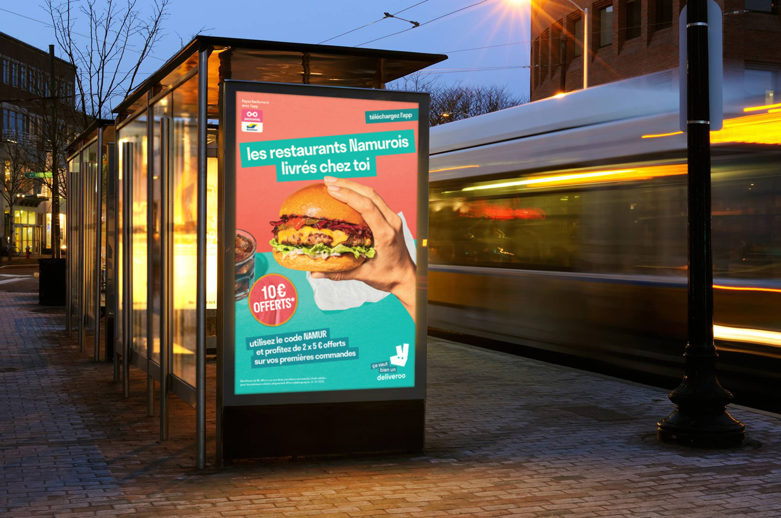
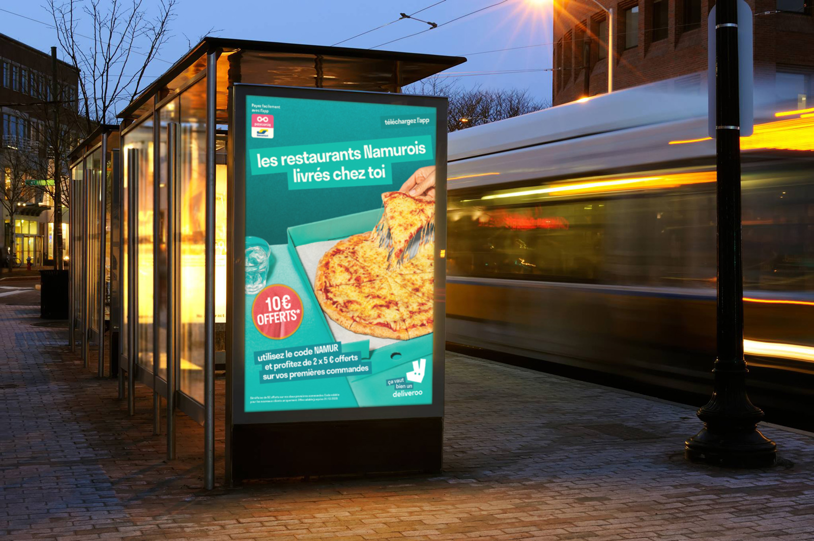
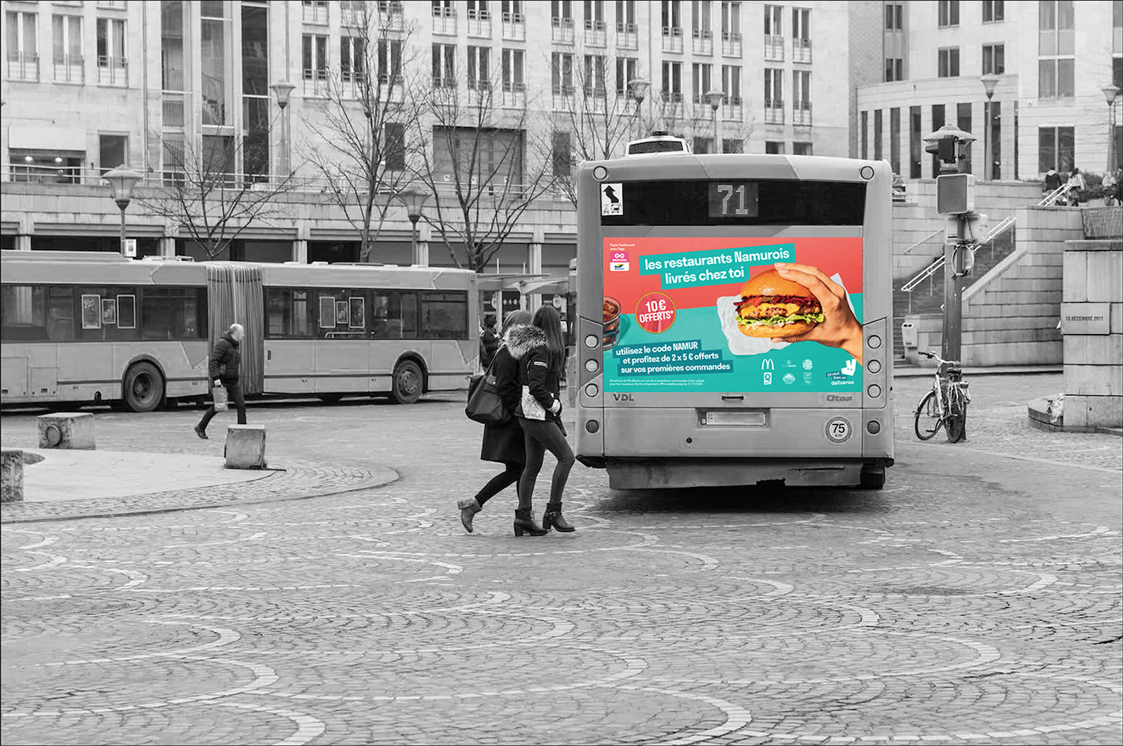
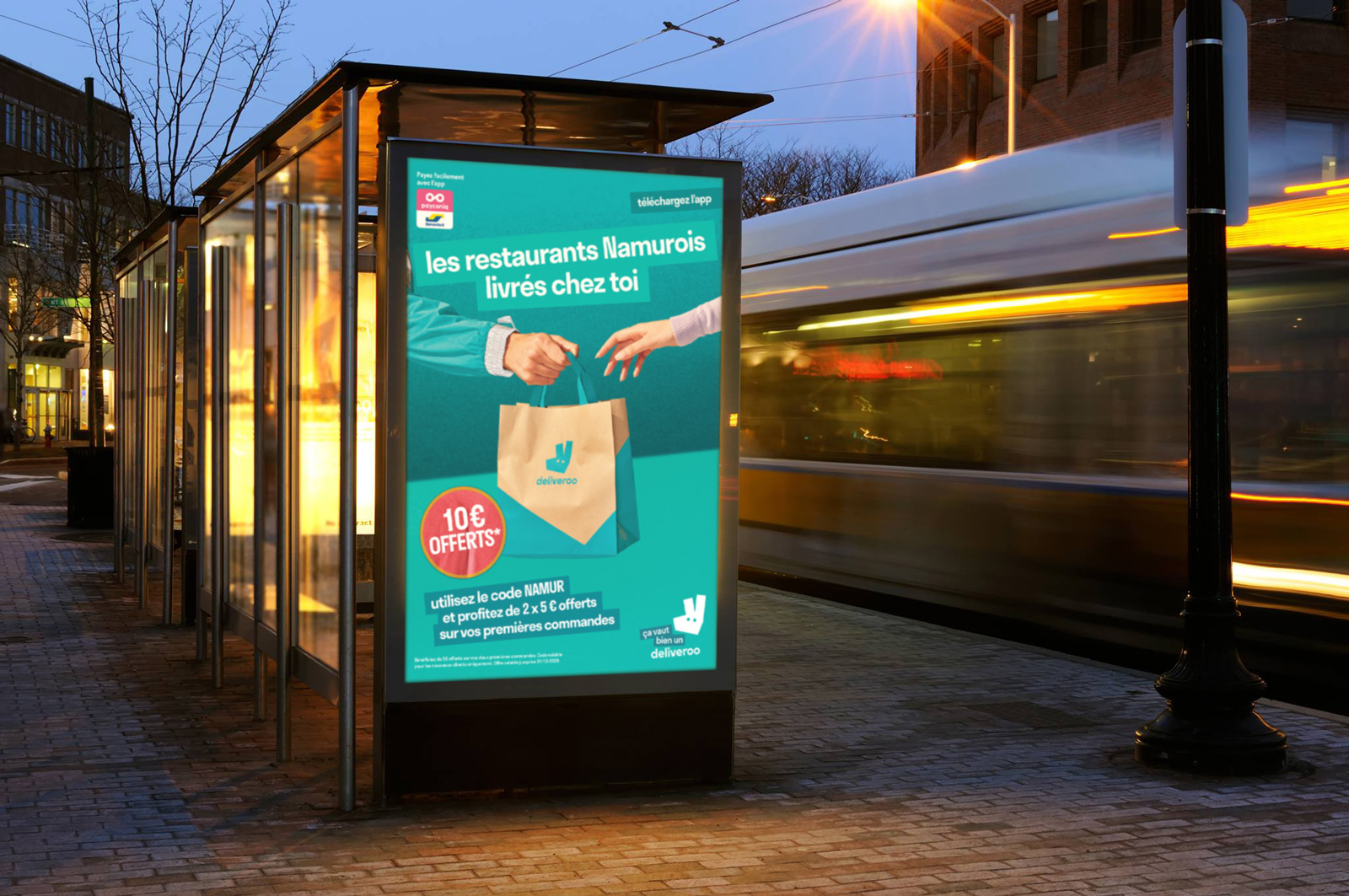
OOH (Out of Home) Advertising
At Deliveroo I worked on dozens of varied OOH print projects such as posters and wraps for buses and bus shelters, for all markets. Using After Effects, I also created digital (DOOH) moving versions of advertisements like these.
When designing print assets for OOH advertising, it is extremely important to understand the technical specs even before setting up the files, as these can vary wildly between different markets and printers, and are often in another language.
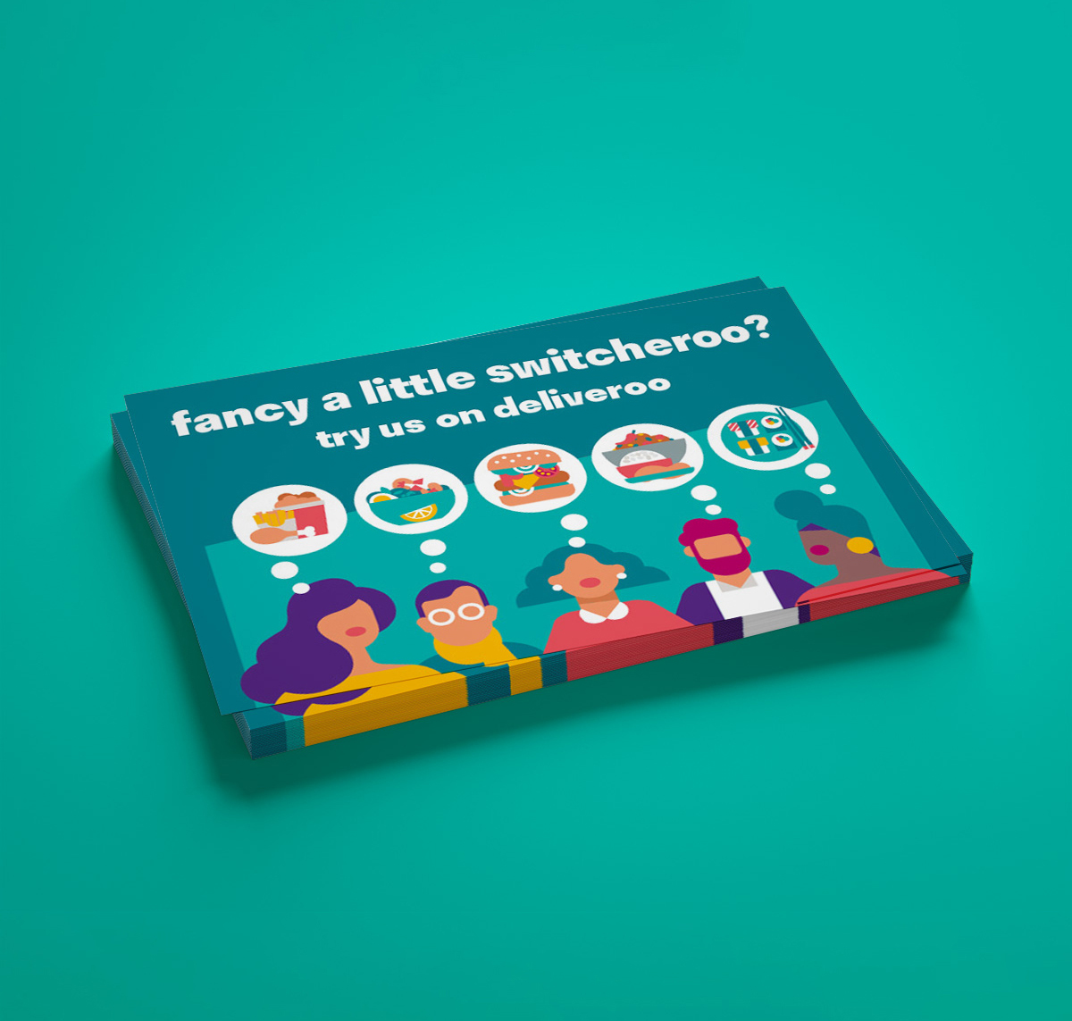
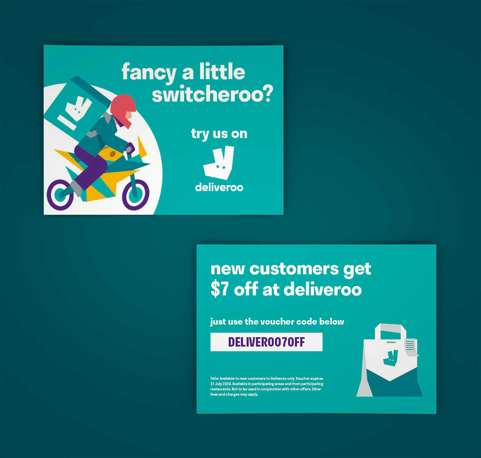
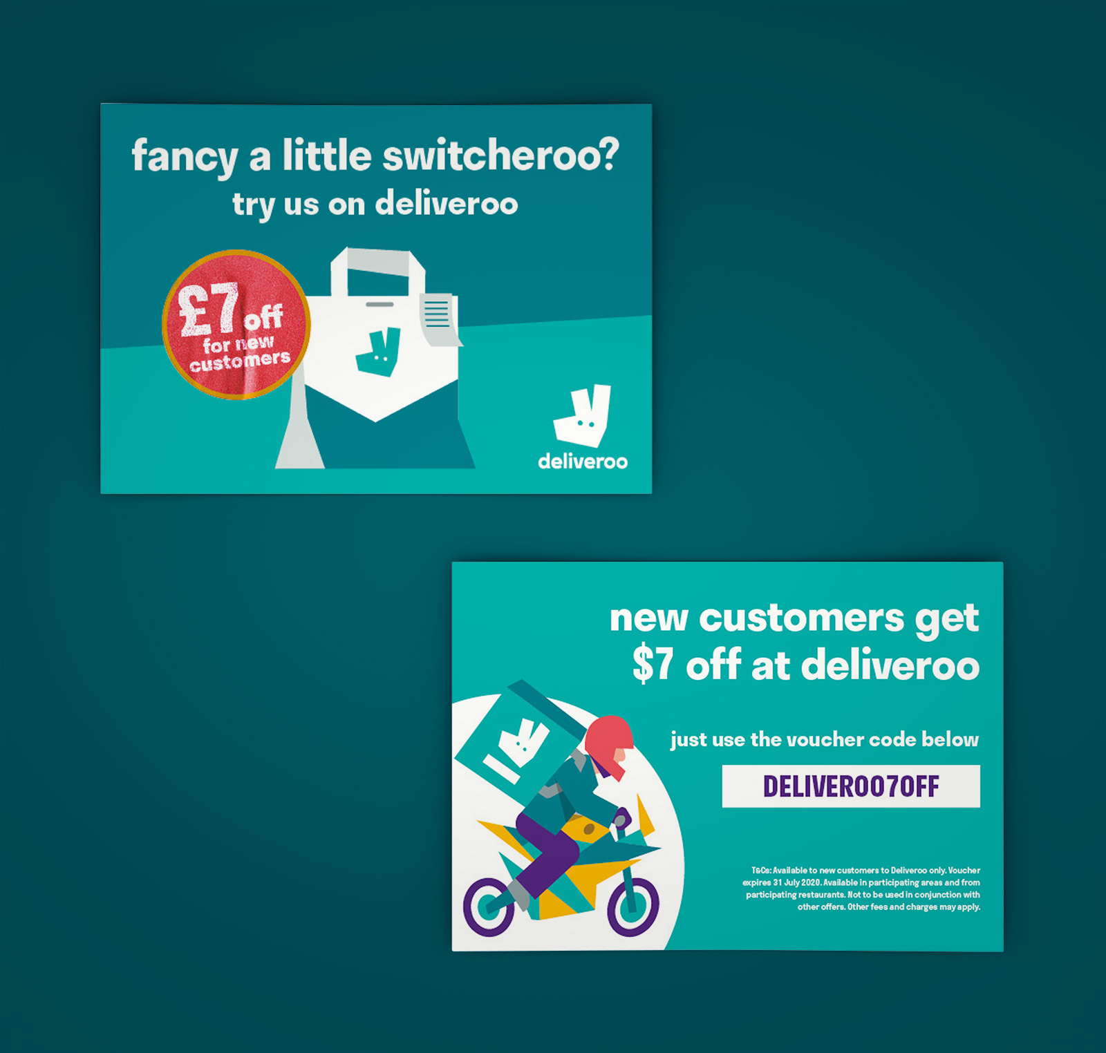
New Customer Promo A5 Flyers for Australia
I designed many different versions of this A5 print flyer for new customers in Australia, finally sending two versions each of the front and back for the local office to choose from, or for A/B testing. They loved both!
I chose these illustrations from previous projects in the studio library, and was asked to include the signature distressed red sticker on some of the designs.
In my time at Deliveroo I designed hundreds of print flyers, including versions for different markets (in different languages) and often delivered editable PDF print docs so that some text elements such as local restaurant names and offer expiration dates could be easily changed before printing.
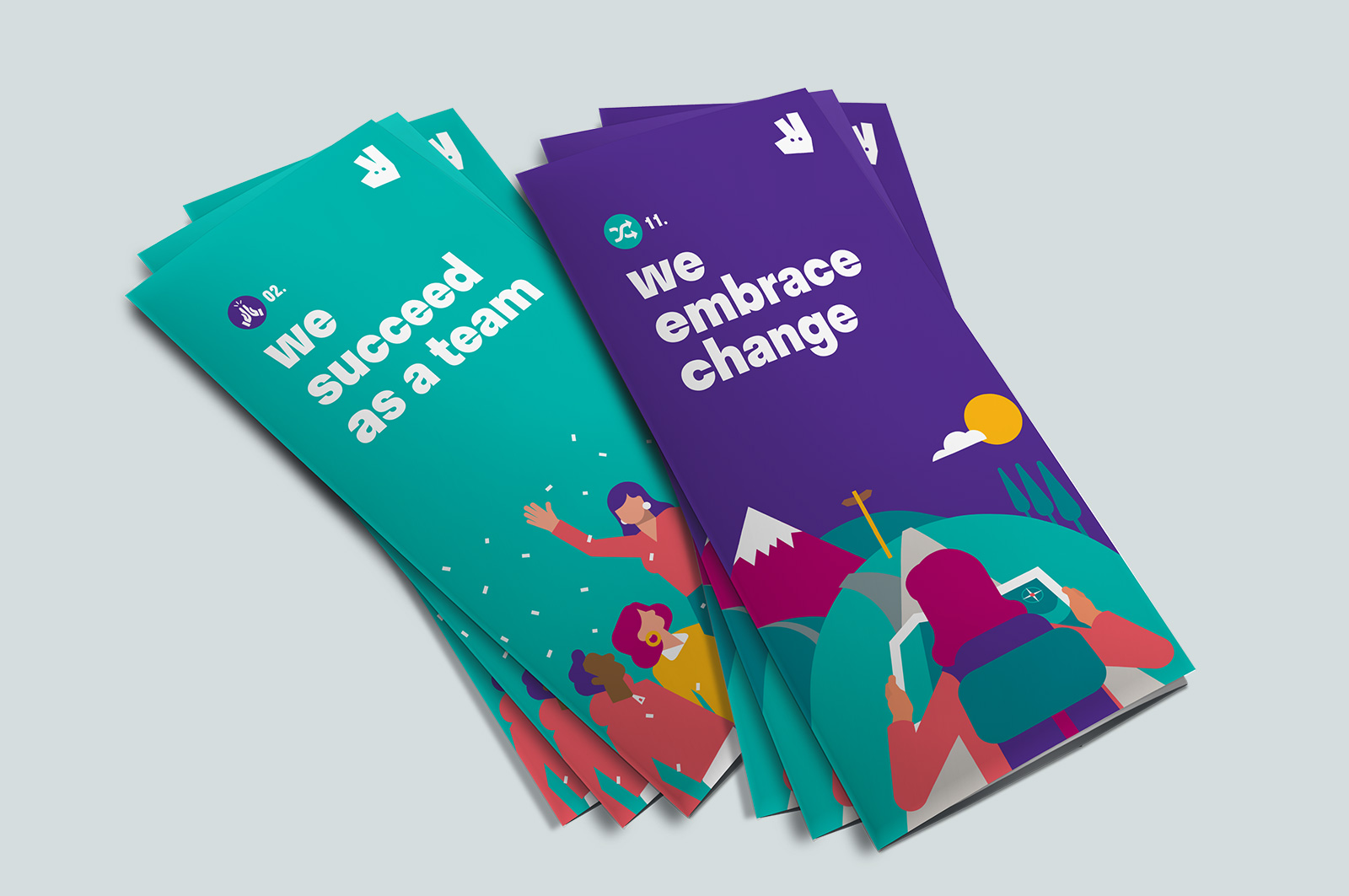
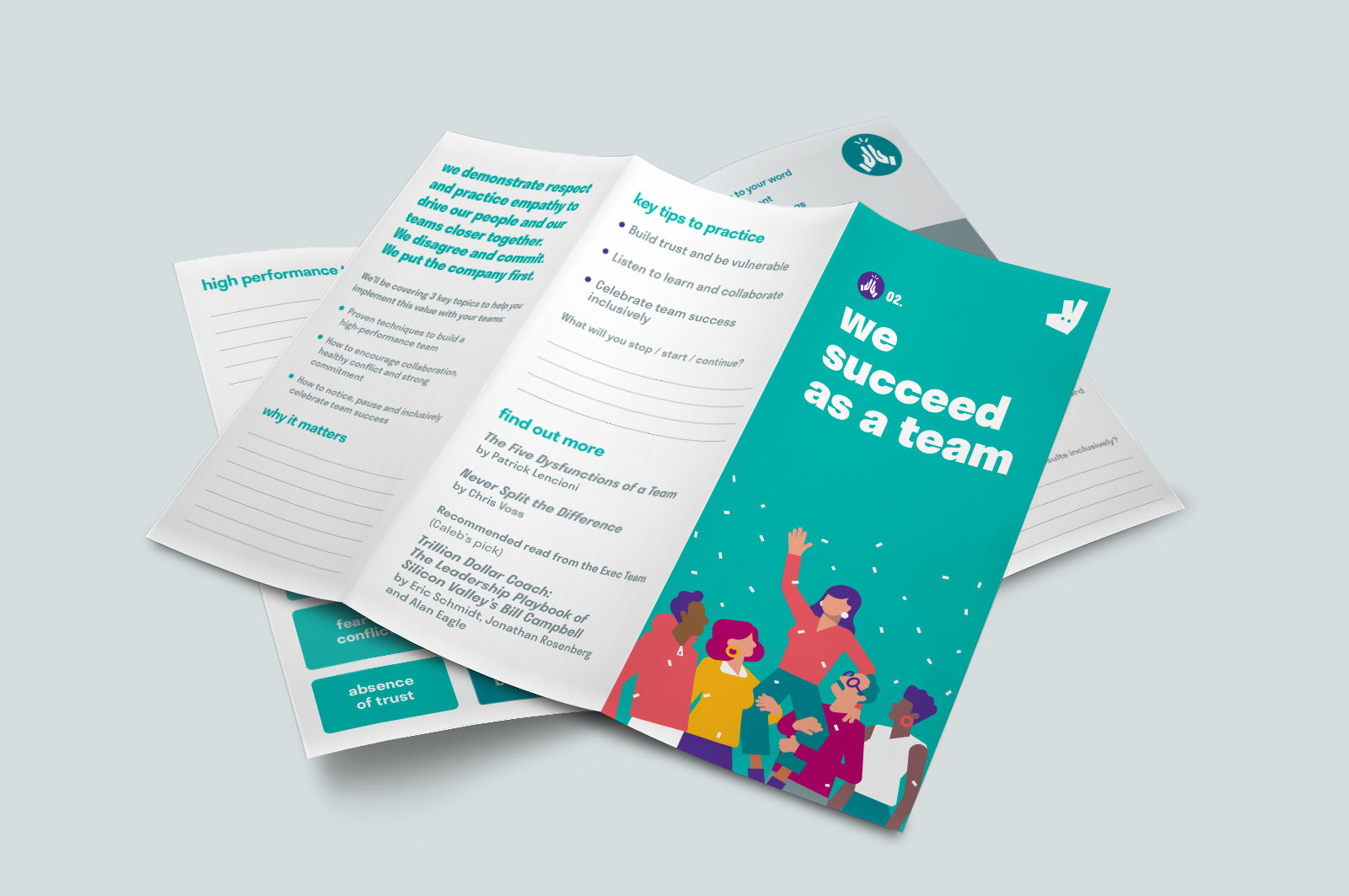
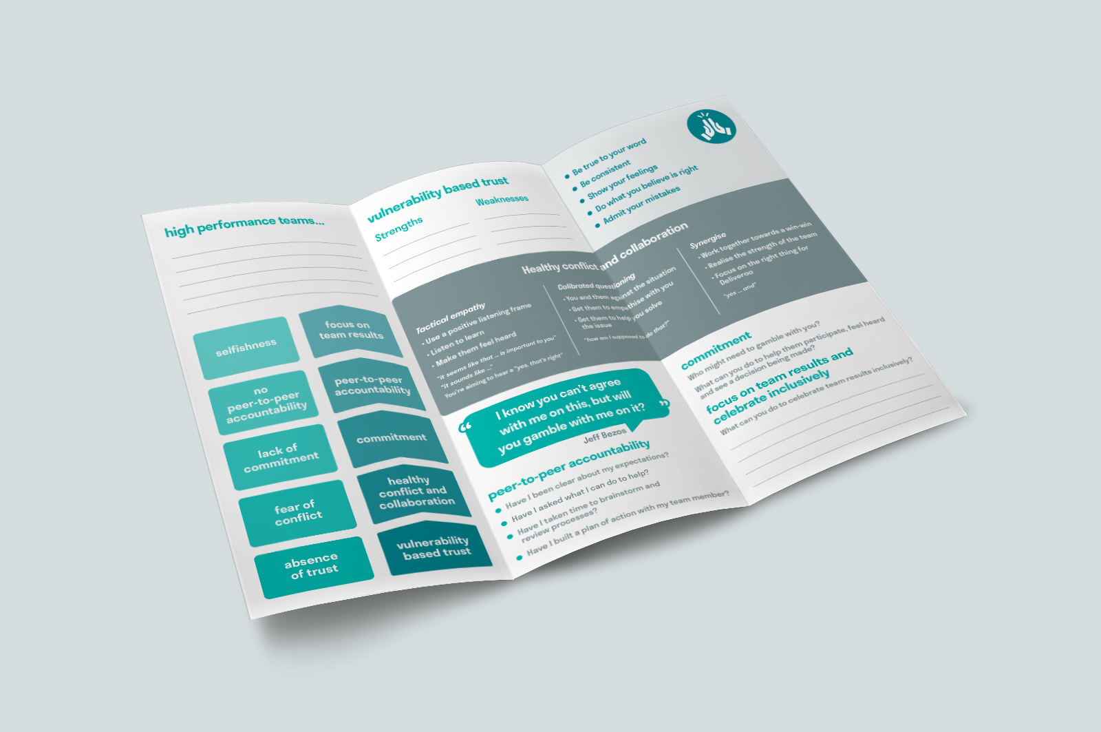
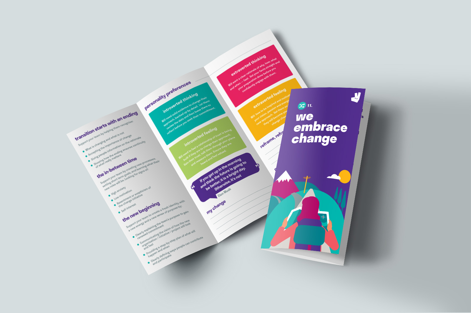
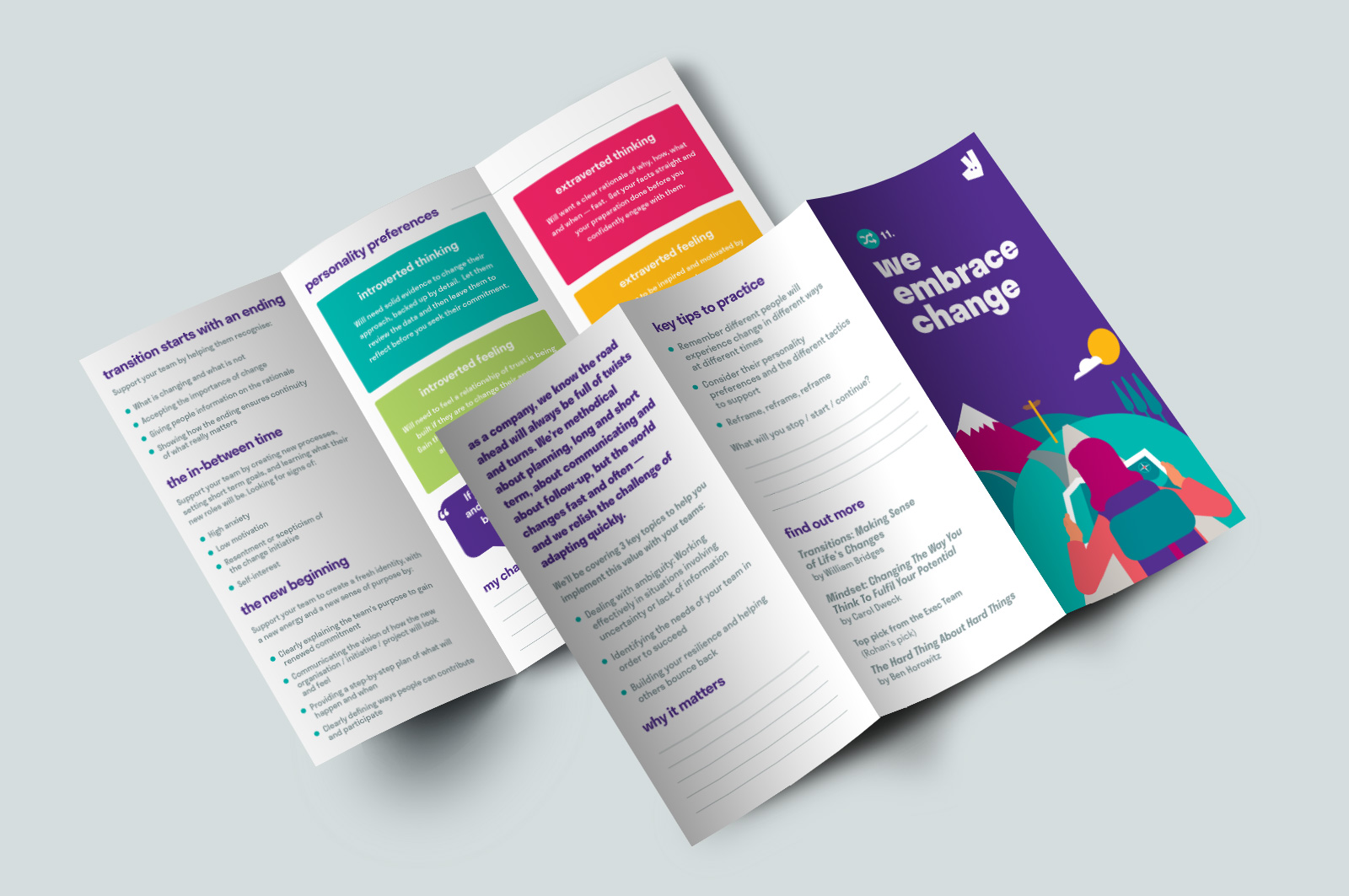
Management Training Trifold Brochures
For these management training brochures, I was given a couple of pages of content, a rough pencil sketch of the proposed arrangement (e.g. a box with “space for writing”), and the creative freedom to design a neat, readable print layout that would lay the groundwork for the full series of brochures as more content became available.
The feedback was very good. The project manager was pleased with the look and layout of the brochures, and the creative director commented that I’d done really well with fitting a lot of content onto one page.
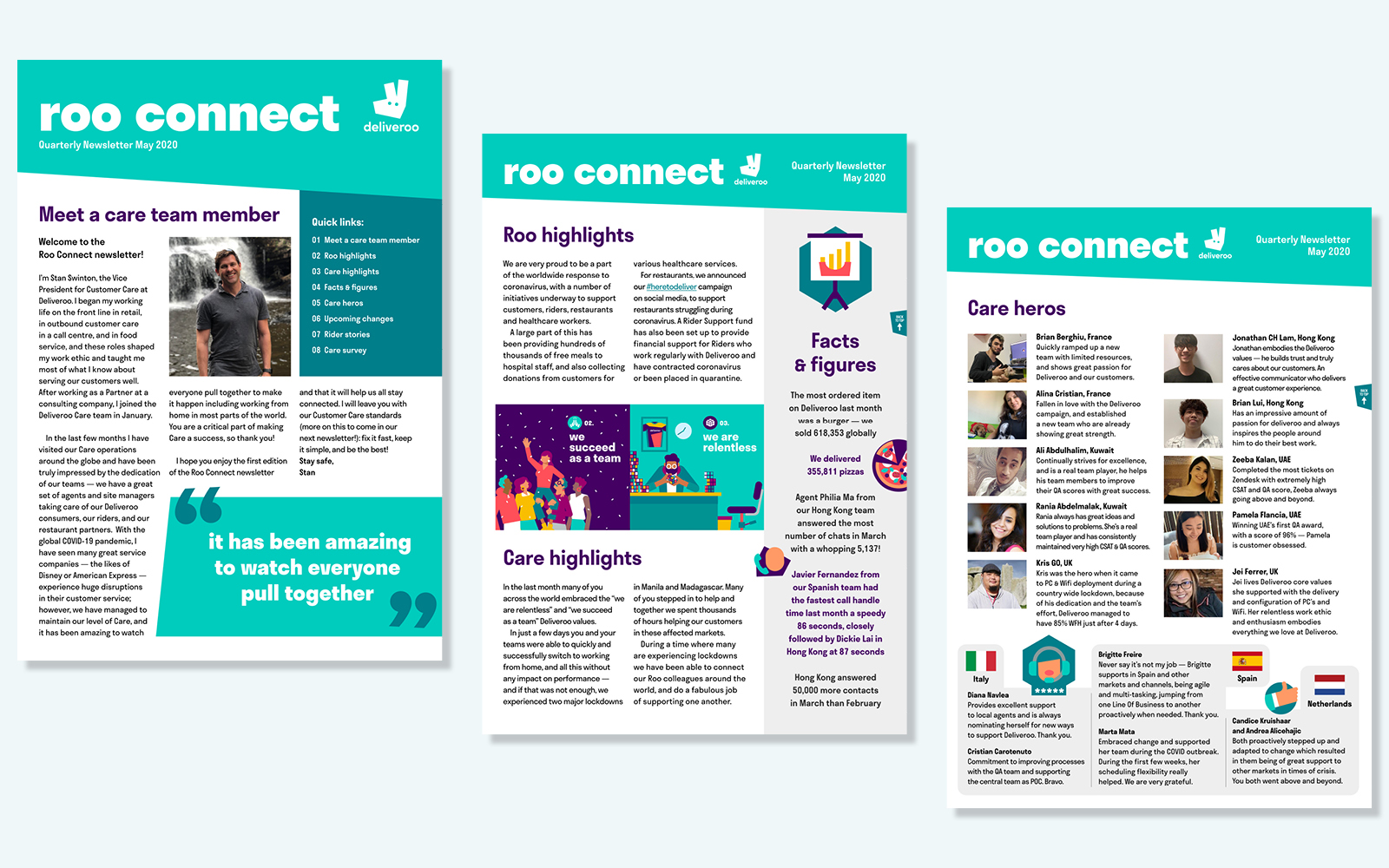
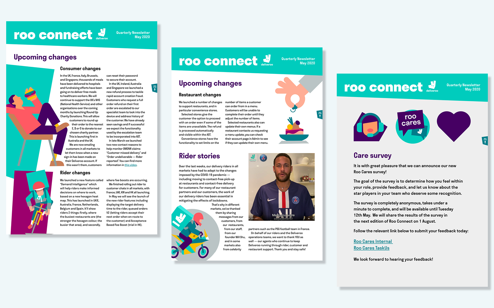
Agent Newsletter Interactive PDF
Because this was the first ever issue of the agent newsletter, I had the opportunity to design it from scratch, thinking ahead about the placement of text and images in order to accommodate versions in other languages with longer words. I was supplied with the copy and a few photos, and had access to the full library of illustrations to choose from. This PDF would be viewed on screen so I included a clickable table of contents and “back to top” buttons on every page.
In this project I was able to draw from both my 12+ years of working in magazine publishing (both as an editor and designer) as well as the UI and interactive elements involved in designing and building WordPress websites. I also delivered versions of this newsletter in Spanish, French and Italian. The translated text was supplied; I worked together (remotely) with a native copywriter for each language to cut the text down to fit. My multilingualism came in handy here — I don’t know how we could have managed to do the copyediting in real time if I were not already familiar with those languages.
The feedback I received was very good: many compliments on the format, typesetting and capturing the Deliveroo brand style on each page.